Frozen X-Plosion Enhanced Smoothie Base Packaging Redesign
After a consumer road show, Frozen X-Plosion (FX) found that their packaging did not effectively communicate with the consumer. The consumer did not understand exactly what the product was, how to use it, nor its benefits.
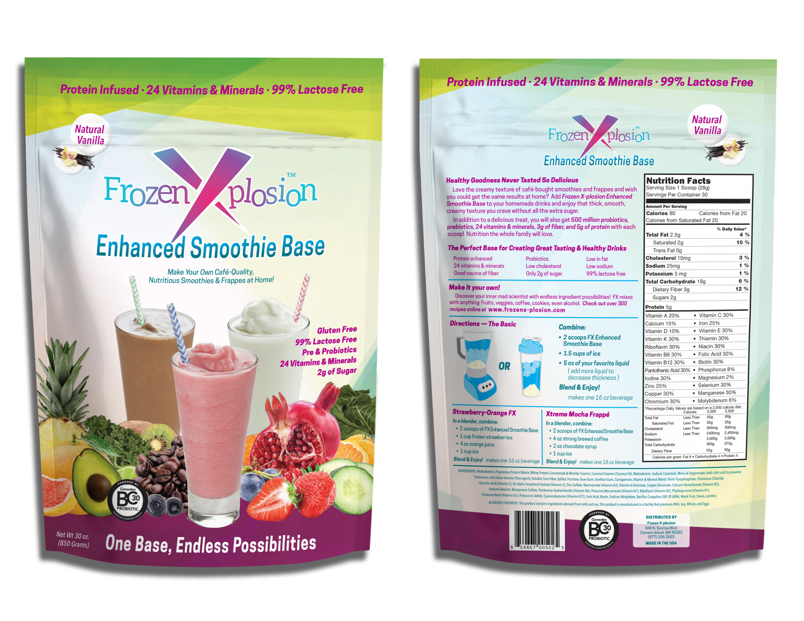
On the front, we replaced the smoothie photography with images that were more appealing and cleaned up some of the original assets. We changed the product name to “Enhanced Smoothie Base” and enlarged it. We agreed that the product is enhanced with more than just protein and wanted to better communicate that with our consumers. We enlarged all of the callouts and tagline. When the original design was printed the text was very small and illegible to older consumers. We also agreed that the BC Gannon Probiotics emblem should be on the front of the package as their high-quality probiotics are a major differentiating feature of FX Enhanced.
We completely overhauled the back of the package to better highlight the product’s benefits and usage directions. I re-wrote the copy to more clearly define the product’s benefits. We made the mixing directions more approachable, added an illustration, and included some recipe suggestions.
MockupThe Redesigned Package
Flat ArtworkThe Original Packaging
Created by Flare Flexible Packaging Corp.
